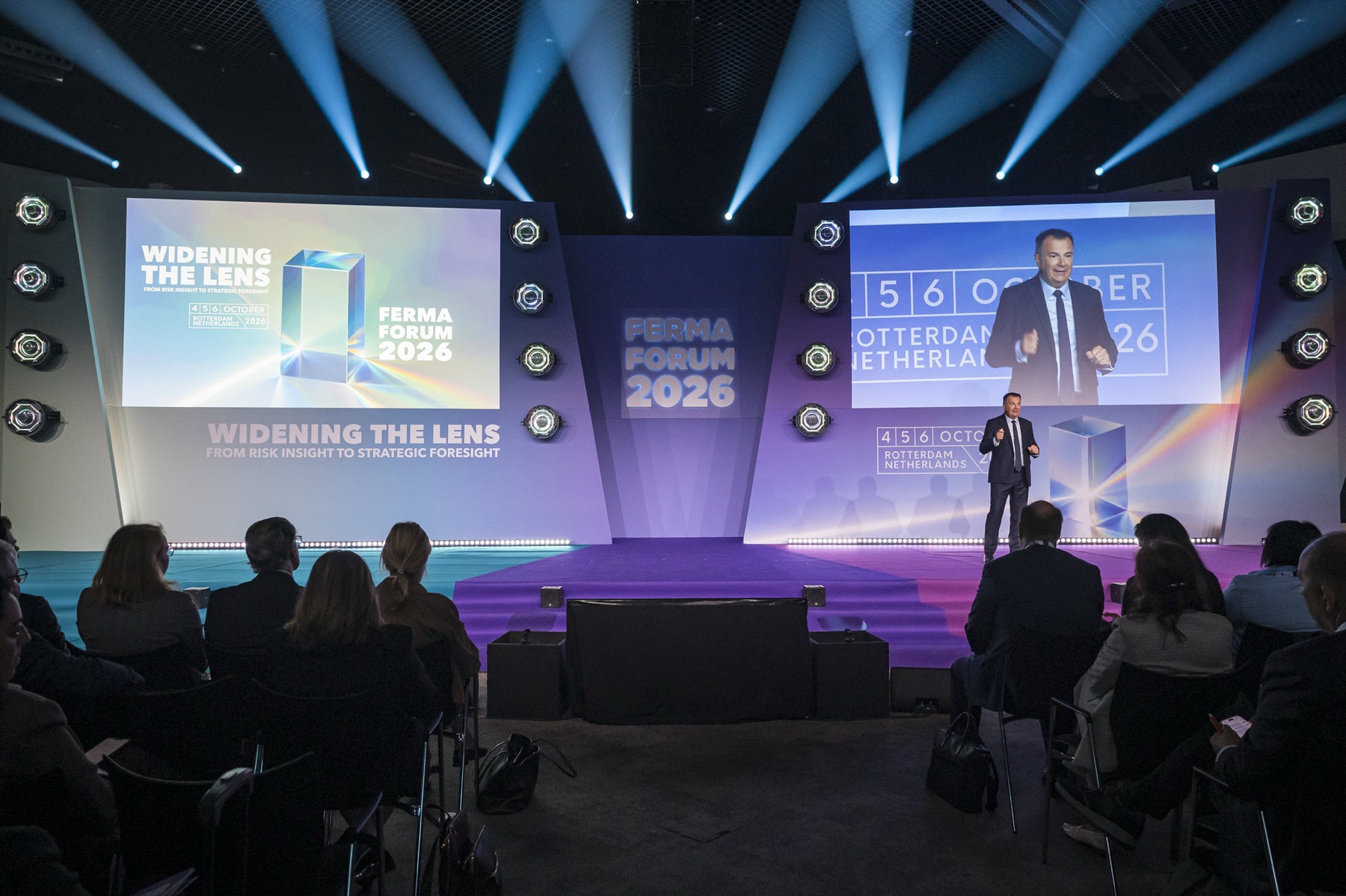
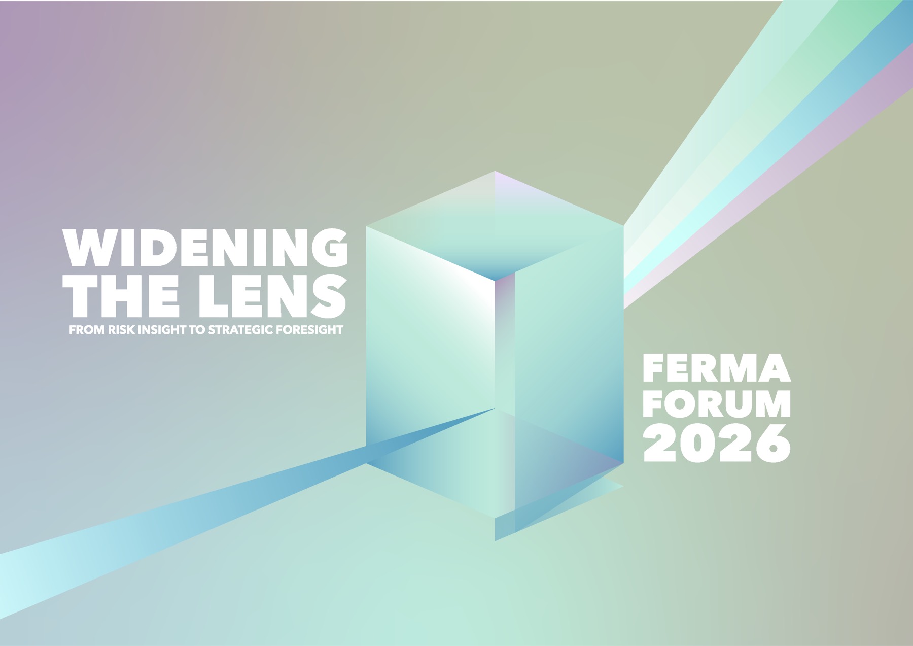
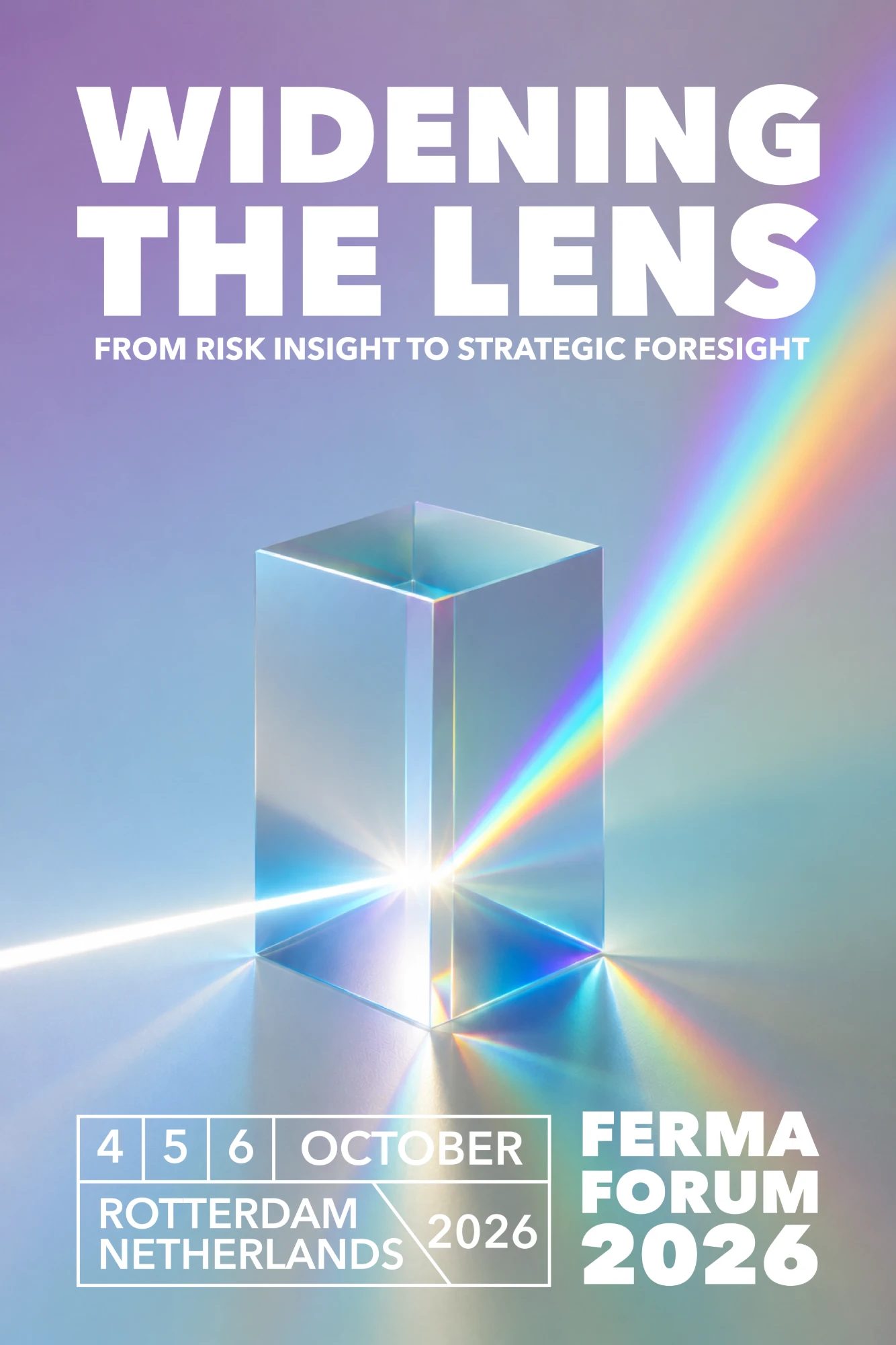
For the second edition of the biennial Forum we designed the whole event identity for FERMA, the Federation of European Risk Management Associations: a logo, a colour system, a typeface and a set of materials that carried the theme “Widening the Lens: From Risk Insight to Strategic Foresight” from the first save-the-date to the venue in Rotterdam.
The idea: from lens to prism
The theme invited us to visualise a lens, a symbol of focus and careful observation. But a lens alone only sharpens one point of view, and risk management is about multiplying them. So the lens became a prism: it collects light and refracts it into a spectrum, revealing what is usually hidden, and it breaks complexity down into clear parts.
The logo
The prism stands for the transparency risk managers need to spot weak signals, and for a multifaceted approach that brings different viewpoints together. We drew it minimal, in line with FERMA’s innovative values, with the translucent look of contemporary interfaces and the geometric architecture of Rotterdam as backdrop.

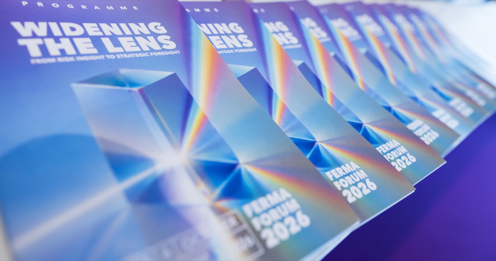
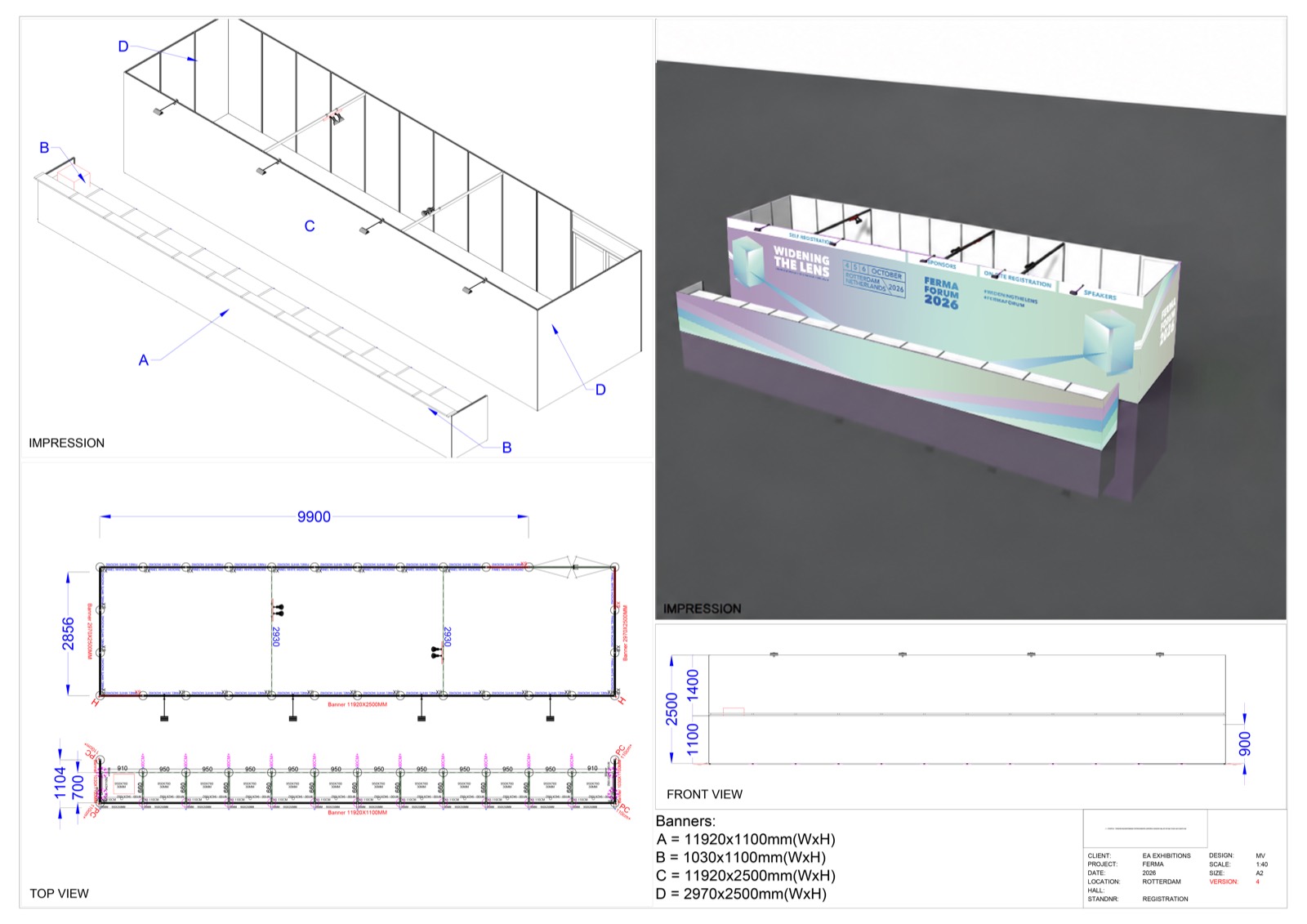
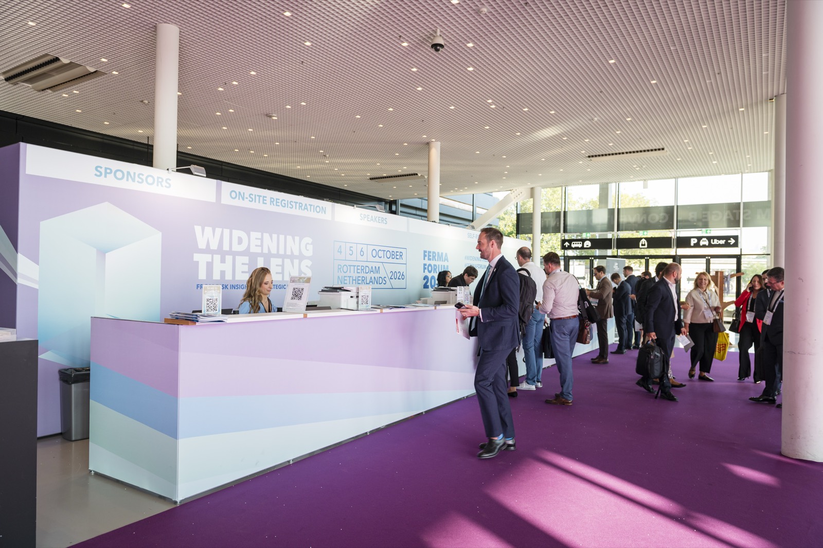
The registration desk
On 5 and 6 October 2026 the Forum opened at Rotterdam Ahoy. The first thing delegates met was the desk: first as a 3D project, then in the hall.
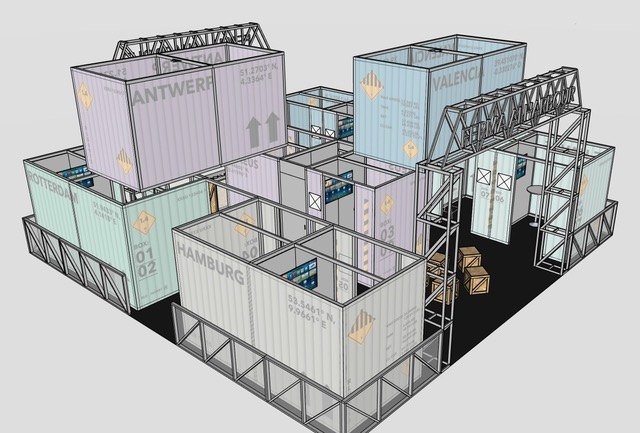
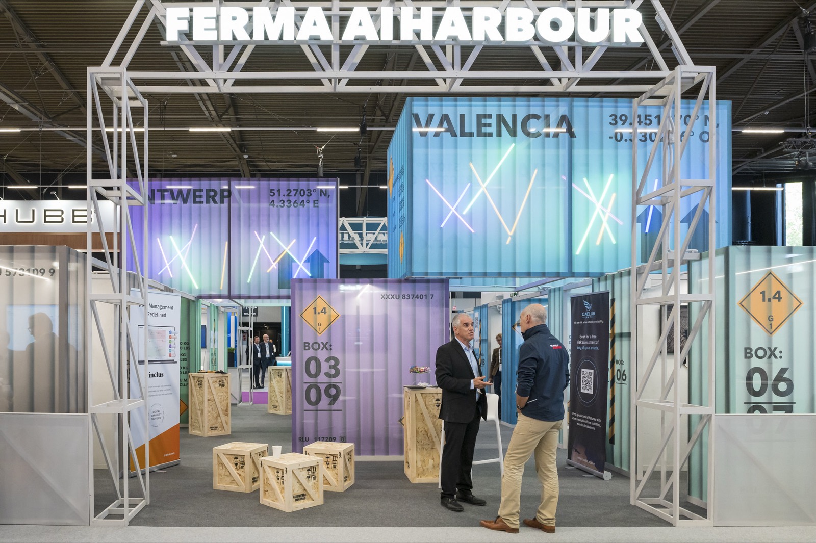
The AI Harbour
A stand built from containers, designed screen by screen: the 3D wireframe and the real stand on the day, and a look at how it was made.
The making of
We wrapped it up in a short film: from the first prism sketch, through the plans and the layouts, to the finished Forum.
Are you interested in discussing the visual identity of your event? Get in touch!
Let’s turn your brand into something people remember.